UX: Less is More
User Experience: Less Is More
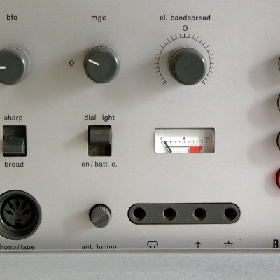
Options can often be blended together into more concise, better presented set of fewer choices. Choice can be difficult, or worse -paralyzing. Users (or consumers) can get frustrated when given too many choices.
User Experience: Coffee
I was a barista at one point - I can anecdotally tell you people cannot tell the difference between coffee blends on any given day. For a little over a year I learned a couple things: First, I am a terrible barista. Secondly, and the repeat my original theory - people either didn’t care, or didn’t know the difference between what they asked for and what I gave them.
Better User Outcomes
You might want to tar and feather me, but I have a couple observations. Ignoring the illusion of choice and any theory-ladenness, people got their drinks faster and in the end appeared to be just as satisfied. Too much choice may ultimately be a source of user dissatisfaction. A lack of a clear call to action on a website may find a user feeling stranded, feeling confused, or feeling overwhelmed by that “totally awesome” homepage intro or 6 element slideshow.
Analysis Paralysis
That slideshow needs at most three slides. Let go of all the items in the your navigation menu - this is hurting the experience of your application. Frustration and fatigue are symptoms of analysis paralysis. This applies to everything. A former colleague told me that great design comes from “finding the essential parts by taking everything away until just before it breaks or no longer makes sense.” I drew a circle and retired the champ ever since.
Streamlined User Experience
Users want control. At the same time, users don’t want the ability to shoot themselves in the foot - even if these goals are contradictory. It has to be fast, but robust - complete yet simple and intuitive. How is this possible? Well, you give your users a very limited, specific set of options. By streamlining the experience down to it’s core essence, users get what they want faster and you achieve the goal the interface set out to achieve.
Bad User Experience Example
https://en.wikipedia.org/wiki/Windows_Vista_editions#Editions_for_personal_computers
Tap or click on these posts to navigate to the next or previous posts.


This post is part of a larger series. Tap or click on a post to view more in this series.